Tonight I want to cover something that has really interested me lately: how to mix and match colors in an outfit. When it comes to wardrobe color combinations, most people follow intuition for what they think looks good. While this works well for some, there are plenty of others who don’t feel confident in their ability to combine colors and stick with blacks, whites, grays, and other neutrals. Don’t get me wrong, neutral outfits can look amazing (with the right elements), but ya’ll colors are so fun– especially in the Spring!
In a moment I’m going to share a few principles I hope rock your world because they rocked mine.
But first, the outfit…
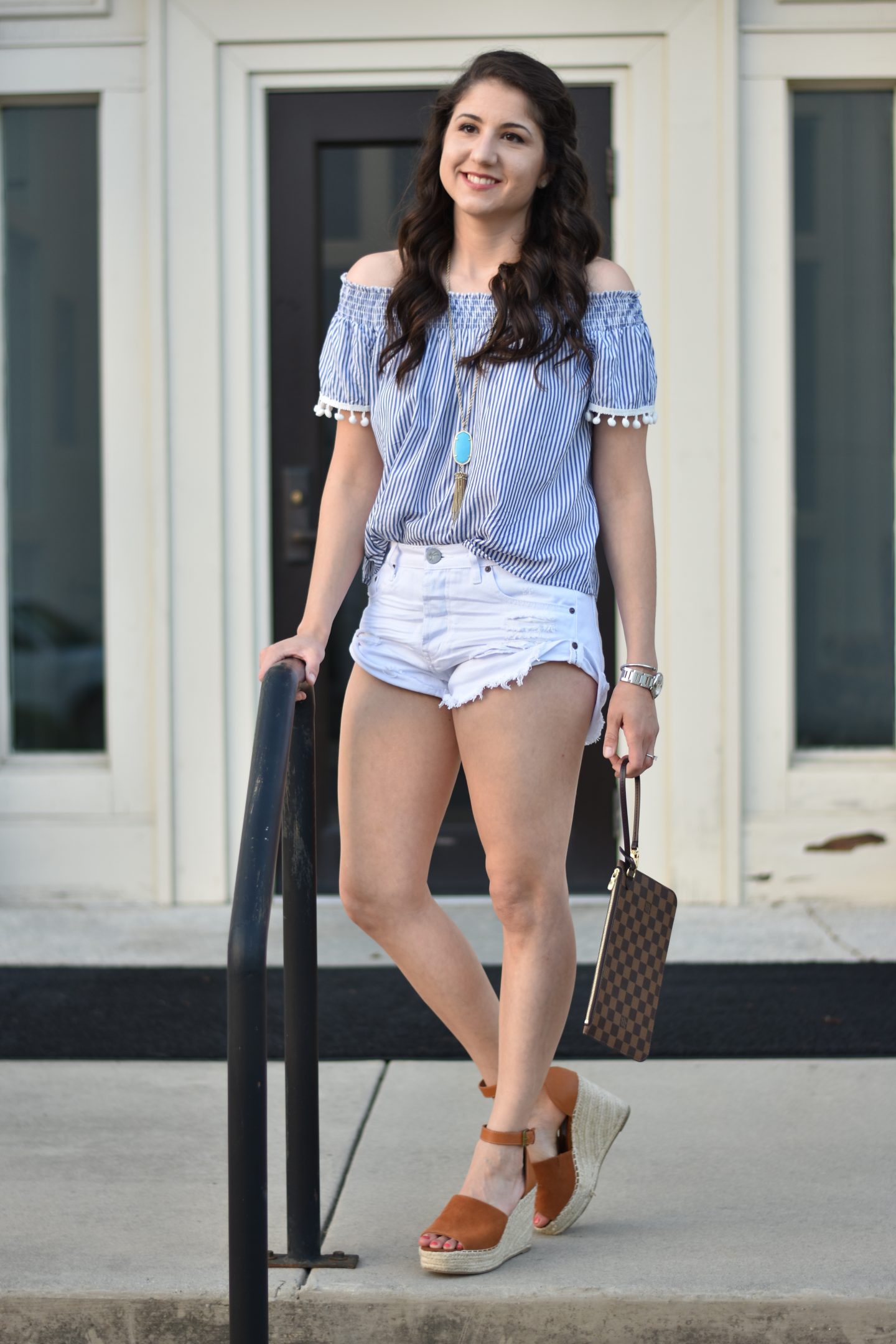
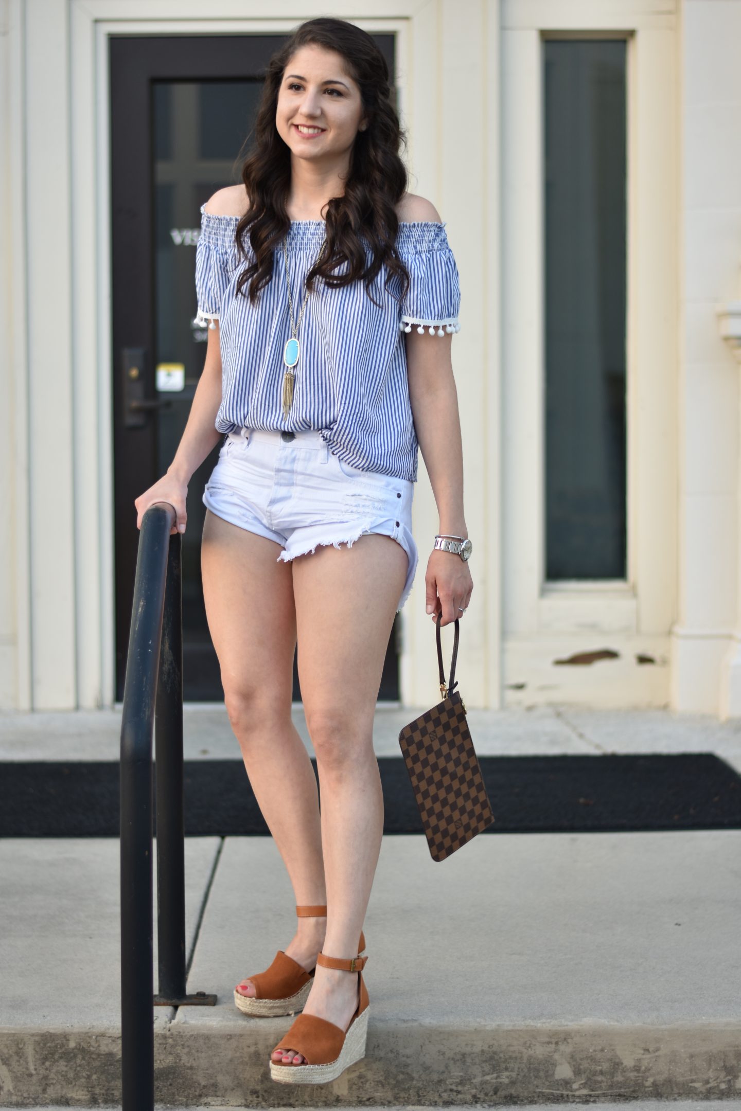
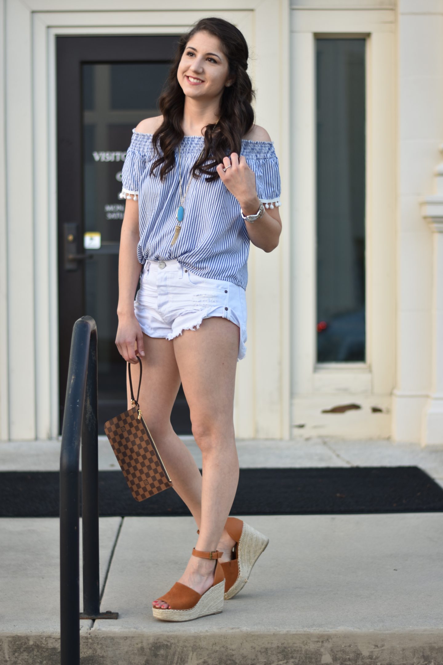
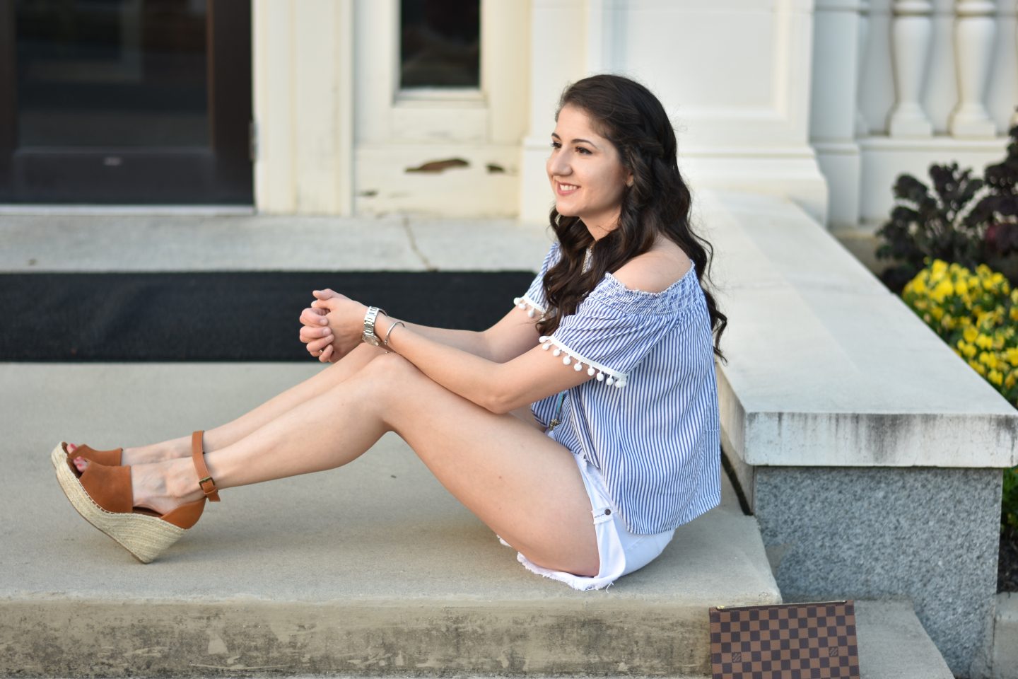

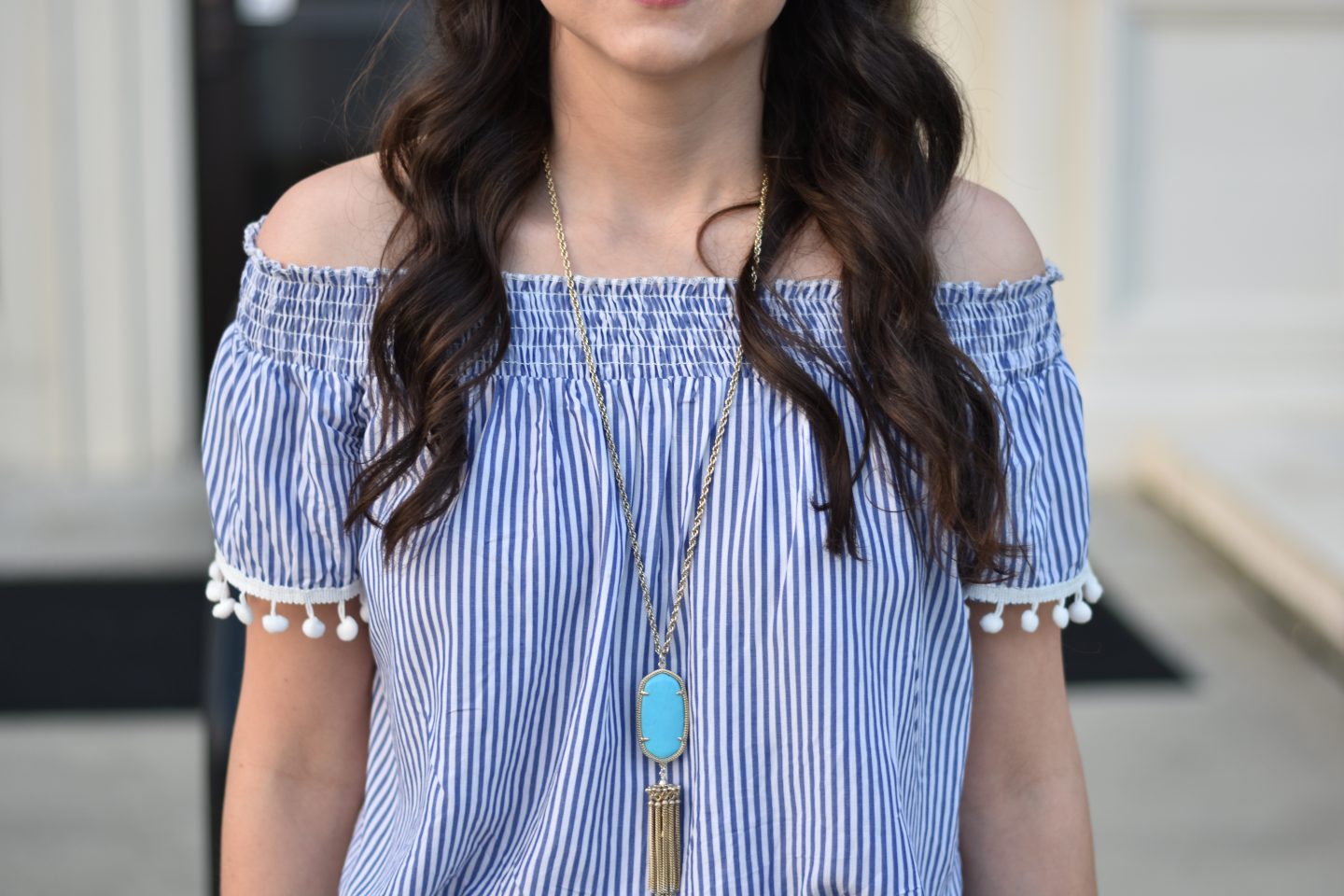 Top (linking the pink striped option because the blue is sold out online. I checked with Nordstrom, and there are dozens of the blue in all sizes in various stores; if you want it, call Nordstrom customer service 888-282-6060 and give them item #5353793)
Necklace // Shorts // Shoes // Clutch
I’m wearing a necklace that is a rather different shade of blue than the stripes in my top, but it works. It turns out combining shades of the same color is one of the easiest ways to mix color in an outfit. The only color I recommend treading lightly with when it comes to mixing shades is red; it can be done but is a little trickier. Pick any other color though, and you’re golden! In this outfit I have also mixed shades of brown. Now, granted that’s more of a neutral but the same principle applies. The dual browns in my clutch mix to form a pattern, then my hair complements the darker shade and my shoes the lighter shade to tie everything together.
Before talking about other ways to mix colors, I want to share the color wheel since it’s a visual that really helped me:
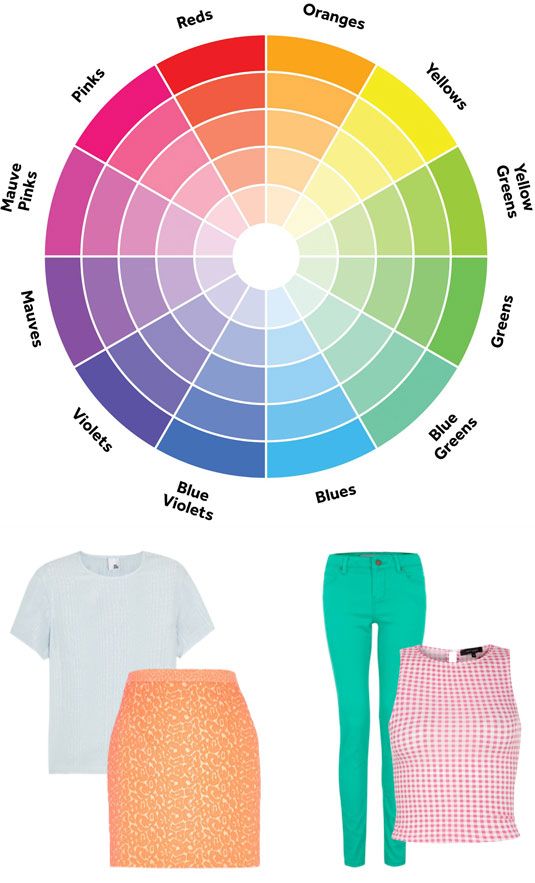
The outfits below are some pretty great color combinations…right? Well, it turns out there’s a principal behind them. When thinking about mixing colors in this wheel there are a few easy hacks:
- Complementary colors mix well, but split complementary colors mix even better. Ok, so what is a complementary color, and what the heck is a split complementary color? Complementary colors are those that are opposite to each other on the color wheel; in the above blue is directly opposite to red and therefore its complementary color. Split complementary colors are the colors immediately to the right and left of the complementary color; in the case of red, the split complementary colors are blue violets and blue greens. A directly complementary color will create a high level of contrast in your outfit, and split complementary colors not quite as much.
- Analogous colors mix well when matched to the same intensity (same level of light or dark). Analogous colors are those immediately to the left and right of a color; in the case of red, it’s pinks and oranges.
- When the hue of a color is light, it is easy to mix with another hue that is equally light. In the wheel, the circle at the center of is very “pastel”; pastel colors create less contrast and are easy to mix together.
One other quick tip: if you have a printed accessory (e.g., a scarf or statement bag like those floral embroidered numbers that are so hot right now), add other colors in your outfit that are the same as those in your accessory. This will help pull the look together and make it look really cohesive.
And there you have my thoughts on color mixing. If you want to keep this color wheel for easy reference, just take a photo with your phone and you’ll have it any time you’re out shopping!
XO,
Terra
